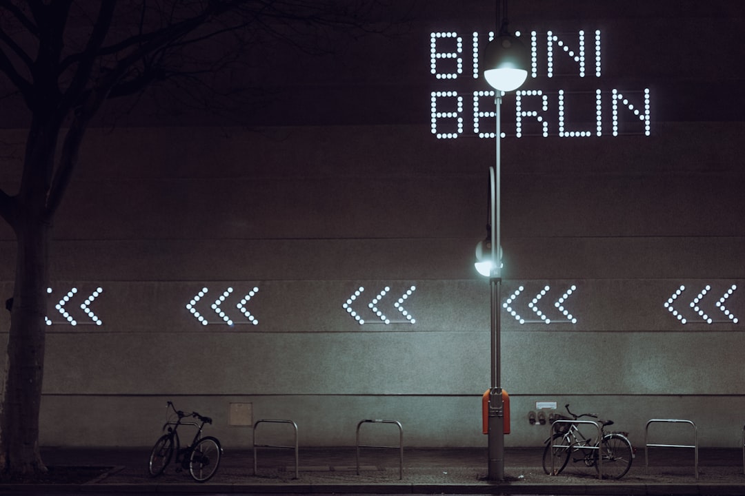
Most brand manuals are built around one instruction: protect the logo.
Berlin Museum has taken almost the opposite approach.
The institution’s new identity uses nine typefaces that can be paired into as many as 81 logo combinations, according to Creative Bloq. The museum itself describes the mark as a dynamic logo built from Berlin’s typographic diversity — from U-Bahn signage to hand-painted neighborhood shop signs.
At first glance, that sounds like a branding system designed to break the rule that recognition requires sameness.
It actually demonstrates a more useful rule: recognition requires a coherent system.
Variation is not the same as randomness
Berlin Museum says the identity is meant to reflect a city that cannot be told in one voice. The typography deliberately pulls from different visual histories, including references to the Deutsche Oper U-Bahn station and the lettering of Karl-Marx-Allee. The museum’s own explanation of the rebrand makes the conceptual logic explicit: the contradiction is the point.
That does not mean every execution is improvised.
The stronger the variation becomes, the more important the underlying constraints become. A dynamic identity still needs rules governing typography, spacing, hierarchy, color, scale and where combinations are appropriate. Otherwise flexibility becomes noise.
This is why systems like Berlin Museum’s can remain recognizable even when the logo itself changes. The audience is learning the behavior of the identity, not memorizing one immutable lockup.
The brand is the grammar
Designers often talk about brand systems as collections of assets: logo, colors, fonts, photography and templates.
A better analogy is grammar.
Grammar does not tell a writer to repeat the same sentence. It establishes rules that allow an enormous number of different sentences to still belong to the same language.
Dynamic identities work the same way. The goal is not to make each output identical. It is to make each output feel as though it could only have come from the same system.
Berlin Museum is especially suited to that approach because the identity has to unify a decentralized institution. The museum operates across multiple locations and says the new public-facing name is intended to make those sites easier to understand as parts of one organization.
A rigid logo could provide continuity. A flexible visual language can provide continuity while also giving different places, exhibitions and stories room to feel distinct.
Not every brand should do this
The danger is obvious: a dynamic identity can become a designer’s exercise that asks too much of the audience.
Coca-Cola can barely move its core assets without spending recognition. Berlin Museum has the opposite opportunity. Its new public-facing identity is being introduced precisely because the institution wants to become more visible, accessible and legible to a broader audience.
That gives the design system room to teach people how it behaves from the beginning.
The lesson is not that brands should abandon fixed logos. It is that consistency should be defined at the right level.
For some organizations, consistency means one mark repeated relentlessly. For others, especially cultural institutions, media brands and digital products with many contexts, the more durable asset may be a set of recognizable rules.
A system can move without losing itself
Branding has become increasingly dynamic because the surfaces it has to occupy are dynamic. A mark may need to live on a building facade, a phone screen, a social avatar, a motion graphic, a ticket, an exhibition wall and a personalized digital experience.
Systems designed around a single perfect lockup can struggle when the context changes faster than the guidelines do.
Berlin Museum’s 81 possible marks are deliberately provocative, but the underlying idea is pragmatic.
Consistency is not the absence of variation.
It is the presence of enough structure that variation still feels intentional.