One of the hardest design problems in branding is deciding what not to change.
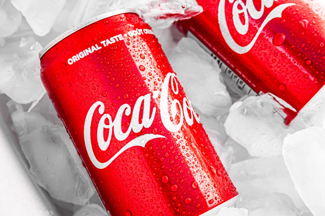
Coca-Cola’s latest global identity refresh is a useful case study because the company has chosen restraint. The system, developed with JKR, does not replace the Spencerian script, Coca-Cola red, the Dynamic Ribbon or the Arden Square. It organizes and amplifies them.
That matters because Coca-Cola is not trying to solve a recognition problem. It is trying to solve a consistency problem at enormous scale.
The company says the new system is designed to create a more unified brand expression across more than 200 markets and across packaging, retail environments, equipment and digital experiences. Coca-Cola’s own description emphasizes the same core assets consumers already know, with clearer rules for how those assets appear together.
Iconic brands pay a higher novelty tax
Young brands can afford to experiment because they are still teaching the market what they look like. Mature brands face the opposite problem: every familiar shape, color, type treatment or visual rhythm may already carry accumulated recognition.
Changing those assets for the sake of looking current can destroy value that took decades to build.
That does not mean an iconic brand should remain visually frozen. It means the burden of proof is different. The question is not whether a new design looks better in a presentation. It is whether the change improves the system without forcing consumers to relearn the brand.
JKR’s work on Coca-Cola is explicit about that trade-off. The agency describes the project as an effort to unify the brand globally by strengthening the assets that already make Coca-Cola distinctive rather than replacing them with a new visual vocabulary. The resulting system brings the Arden Square back into a more central role, sharpens the red-and-white palette and gives the Dynamic Ribbon more consistent use across applications.
A redesign can be an operating system
The most important part of a global identity refresh may not be what the consumer sees. It may be what the organization can now produce.
Coca-Cola is pairing the rollout with a new Brand Center and internal Design Intelligence tools intended to help its own teams and agency partners maintain governance, craft and consistency at scale.
That makes the redesign less like a set of new templates and more like an operating system for creative work.
For a brand that appears on cans, bottles, fountains, coolers, stadium signage, social feeds, ecommerce pages, delivery apps and retail displays in hundreds of markets, inconsistency is expensive. A visual system has to survive thousands of local decisions without becoming unrecognizable or rigid.
That is where design systems create business value: not by making every execution identical, but by making the rules strong enough that different executions still feel unmistakably related.
Architecture matters more than decoration
The treatment of Coca-Cola Zero Sugar shows the difference between decoration and architecture.
The refresh brings Zero Sugar closer to the master brand while preserving clear variant signals, including larger Zero Sugar typography, a black Dynamic Ribbon and a black bottle cap on PET packaging. The point is not merely to make the package look cleaner. It is to make the relationship between master brand and product variant easier to read.
That kind of hierarchy becomes increasingly important as portfolios expand. If every product variation develops its own visual language, the parent brand loses leverage. If every variation looks identical, consumers lose useful distinctions.
A strong system has to do both jobs at once.
The best redesign may barely look redesigned
Design culture often rewards visible transformation because dramatic before-and-after comparisons are easy to understand. Businesses do not always benefit from the same thing.
For a company with enormous existing brand equity, a subtle redesign can be more ambitious than a radical one. It asks the design team to create greater clarity, flexibility and consistency without spending the recognition the brand already owns.
That is the useful lesson in Coca-Cola’s refresh.
The work is not interesting because Coca-Cola suddenly looks different. It is interesting because the company is trying to make a 140-year-old visual language perform more reliably across a much more fragmented set of modern surfaces.
For mature brands, that may be the real measure of successful evolution: consumers should still know exactly who you are, while the organization gets much better at showing them.