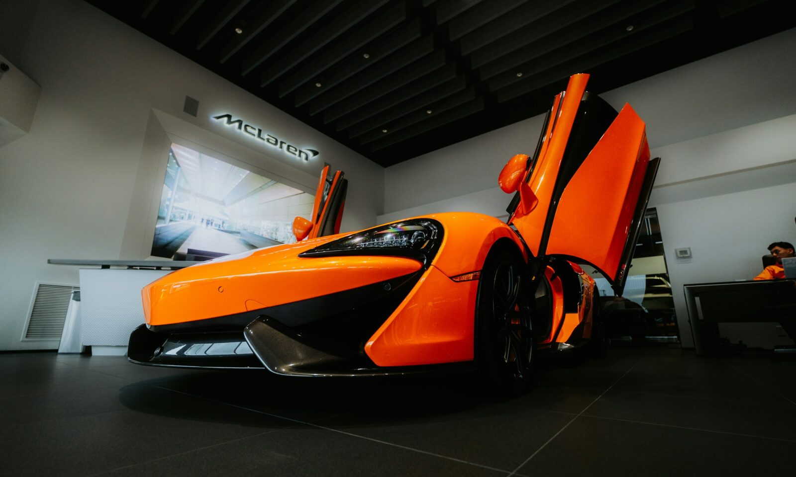
McLaren unveiled a new visual identity on Sept. 22, 2026, joining its automotive and racing businesses under a common design language as the British marque prepares to broaden its vehicle range and fan experiences. The change makes the company’s founder, rather than a new car or race result, the organizing idea for its next phase of growth.
The centerpiece is a redesigned McLaren wordmark drawn from the sign above the Auckland service station run by Bruce McLaren’s parents. The company says it will appear across McLaren Automotive and McLaren Racing, while retaining familiar elements including the Speedmark, the Speedy Kiwi and papaya orange. This is not a wholesale erasure of the existing brand. It is an attempt to make its history legible across more products and channels.
A common identity for two different businesses
McLaren’s announcement describes one connected expression for the road-car operation and its racing programs, including Formula 1, IndyCar and endurance racing. The company says the system is meant to extend beyond vehicles and competition into personalisation, experiences and community. It has not published a financial target for the rebrand or claimed that design alone will increase sales.
The practical significance is consistency. A customer encountering a car, a digital product, a retail space or a race-team touchpoint should see recognizable family traits, even though those contexts serve different purposes. That is an editorial inference from McLaren’s stated plan, not a reported performance result. It also sets a demanding design brief: automotive luxury often calls for restraint, while motorsport sponsorships and teamwear must read instantly in crowded environments.
McLaren’s new wordmark borrows from the family service station in Remuera, where the company says Bruce McLaren built the car associated with his first racing win. The historical reference gives the mark a specific provenance. The continued Speedmark and Speedy Kiwi prevent the story from being reduced to a single typographic treatment. The expanded palette preserves papaya but gives designers more room to distinguish applications.
Why the timing matters
The identity arrives alongside a broader business plan. McLaren says Automotive has confirmed a £500 million program to expand its U.K. manufacturing and engineering footprint and move beyond two-seat supercars with a performance SUV. Its McL 6GT design concept has already put the founder narrative into a vehicle context. The racing side, meanwhile, has marked its 1,000th Formula 1 Grand Prix and announced a World Endurance Championship hypercar program. The rebrand gives those separate developments a common frame without making them the same product.
Autocar reported that the new wordmark is intended for cars, merchandise and digital channels. Chief creative officer David Woodhouse told the publication that the founder reference should not be read as a retreat into retro design. Autocar also reported that McLaren Sans, a bespoke typeface, is part of the new system and that darker tones will play a larger role in the automotive identity. Evo’s account likewise connects the logo to the announced investment and vehicle expansion.
Those details distinguish this from a cosmetic badge swap. A brand system that touches products, communication and commerce has to work at different scales and in different markets. The wordmark’s effectiveness will depend on how it is applied to real vehicles and customer experiences, not on the announcement image alone. McLaren has not supplied evidence yet that the new system changes buyer behavior or fan engagement.
The design test ahead
There is a tension in McLaren’s approach. Founder stories can add authenticity to luxury brands, but repeating a heritage cue everywhere can make distinct offerings feel interchangeable. The new system must allow a road-car customer and a racing fan to recognize the same company without losing the qualities each audience came for. That is analysis of the design challenge, not a prediction that the strategy will succeed or fail.
The company has given itself a usable set of parts: a wordmark with a documented origin, retained symbols with existing recognition and a wider palette. The first public measure will be coherence as the identity appears on cars, racing assets, digital channels and merchandise. The larger commercial measure will take longer. If McLaren’s vehicle lineup and experiences expand as announced, executives will be testing whether a unified identity helps explain a more complex business to customers and fans.