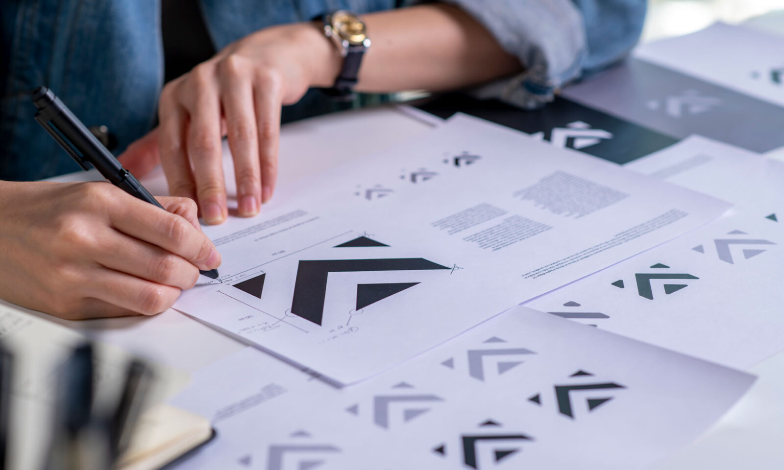
A logo is one of the most recognizable assets a business owns. It can appear on packaging, websites, advertisements, products, social media, signage, and countless customer touch-points. At its best, a logo becomes more than a visual mark—it becomes a symbol that represents a company’s values, personality, history, and promise.
But the process of creating logos has changed dramatically.
Over the past decade, logo development has shifted from a deeply strategic and conceptual discipline into a faster, more simplified process driven by trends, templates, and algorithmic design tools. Many modern logos prioritize minimalism, adaptability, and digital functionality, but often at the expense of storytelling, personality, and emotional connection.
For creative professionals, this evolution raises an important question:
“Have we optimized logos for efficiency while losing what makes them memorable in the first place?“
The future of logo design is not about rejecting simplicity. Simplicity has always been a powerful design principle. The challenge is ensuring that simplicity is the result of strategic refinement rather than the absence of strategy.
The Golden Era of Logo Development: Strategy Before Sketching
Historically, great logo development was a process built around research, exploration, and storytelling.
Designers spent significant time understanding:
- The company’s history
- Its mission and values
- Its competitive landscape
- Its audience
- Its cultural context
- Its future ambitions
The logo was not created as an isolated graphic. It was developed as a visual representation of the company’s identity. Designers explored dozens, sometimes hundreds, of concepts. They sketched by hand, experimented with symbolism, studied typography, and refined ideas through a process of discovery.
Every element had intention. A shape might represent heritage. A color might communicate trust or innovation. A hidden detail might reward customers who looked closer. The strongest logos contained layers of meaning that revealed themselves over time. They were not simply designed to be seen. They were designed to be remembered.
The Rise of Minimalism: From Meaning to Recognition
Minimalism has played an important role in modern design. As businesses expanded into digital environments, logos needed to function across smaller screens, mobile applications, social platforms, and countless digital interfaces. Simplification became necessary.
Brands began reducing complexity:
- Detailed illustrations became simple icons
- Multiple colors became single-color systems
- Custom lettering became cleaner typography
- Detailed symbols became abstract marks
In many cases, this evolution improved usability. However, a problem emerged when minimalism became the objective rather than the solution.
Instead of asking, “How can we communicate more with less?” many brands began asking, “How can we remove more?”
The result has been a wave of logos that feel interchangeable. Many technology companies, financial institutions, and consumer brands have adopted similar visual approaches: clean sans-serif typography, geometric shapes, restrained color palettes, and simplified symbols.
While these logos may be modern and functional, many lack the distinctive characteristics that create emotional attachment. A logo should not simply be easy to recognize. It should be meaningful enough to remember.
The Impact of Algorithmic Design
The rise of artificial intelligence, automated design platforms, and template-based systems has accelerated this shift.
Today, businesses can generate hundreds of logo concepts within minutes. This accessibility has benefits. It allows startups and small businesses to explore ideas quickly and understand basic design possibilities. However, there is a fundamental difference between generating options and developing a brand identity.
Algorithms are excellent at identifying patterns. They can recognize what successful logos often look like. They can combine familiar visual elements. They can produce clean, professional-looking results. But they do not understand the deeper human context behind a business. They do not know why a company was founded. They do not understand the founder’s vision.
They cannot identify the emotional connection a brand needs to create. A logo developed through pattern recognition may look polished, but it often lacks the strategic foundation that gives it meaning.
The Problem With Mass-Produced Branding
When thousands of businesses rely on similar tools, similar templates, and similar design trends, visual sameness becomes inevitable. This creates a marketplace filled with brands that appear professional, but struggle to stand apart.
The danger is not that these logos are poorly designed. The danger is that they are forgettable.
A business logo should help answer:
- Why this company?
- Why this product?
- Why should customers care?
A logo that could belong to dozens of competitors fails to create differentiation. In competitive industries, distinctiveness is one of the most valuable brand assets a company can develop.
Great Logos Are Built on Ideas, Not Trends
The most successful logos throughout history were not created because they followed design trends. They were created because they represented something meaningful.
Iconic logos often succeed because they contain:
- A clear concept
- Strategic relevance
- Emotional connection
- Memorable characteristics
- Long-term adaptability
Their simplicity is not accidental. It is the result of thoughtful reduction.
The designer’s role is not to add decoration. It is to discover the essential idea at the heart of a brand and translate it into a visual symbol. That requires curiosity, research, interpretation, and creative judgment.
The Value of Human Creative Thinking
Experienced designers bring something to logo development that technology cannot replicate: perspective. They understand that a logo exists within a larger ecosystem.
They consider how it will influence:
- Brand perception
- Customer trust
- Marketing materials
- Packaging
- Digital experiences
- Company culture
They know when an idea is too complicated. They know when simplicity has gone too far. They understand that a successful logo is not created by removing everything until nothing remains. It is created by identifying what matters most.
The Future of Logo Development
The future of logo design will likely continue to include technology, automation, and artificial intelligence. These tools can improve efficiency, accelerate exploration, and support creative workflows.
But the most valuable logos will still come from human insight. Businesses do not need more logos. They need more meaningful symbols. The role of designers is evolving from creators of graphics into strategic interpreters—people who transform business purpose into visual language.
For companies investing in their brand identity, the question should not be “How quickly can we create a logo?” Instead, “What idea do we want our customers to remember?”
The Bottom Line
The lost art of logo development is not really about nostalgia for older design processes. It is about recognizing the value of thoughtful creativity. A logo is not simply an image. It is a shortcut to a company’s reputation, values, and promise.
While modern tools and minimalist trends have made logo creation faster and more accessible, businesses must be careful not to sacrifice meaning for convenience. The strongest brands are not built through algorithms alone. They are built through strategy, storytelling, and human creativity.
A great logo does not just identify a company. It tells its story.